Chapter 9 Principal component analysis (PCA)
Learning outcomes: At the end of this chapter, you will be able to perform and visualize the results from a principal component analysis (PCA).
In this chapter, we will do a principal component analysis (PCA) based on quality-controlled genotype data. From the technical side, we willcontinue to work in R.
9.1 Run a PCA in R
The PCA itself is a way to visualize complex systems in a simple way. In our case, we want to show relationships between the worldwide goat populations genotyped in the ADAPTmap project. After the quality control, we have 4532 animals left. If we compute genetic distances (with PLINK), we get a matrix of 4532 by 4532 animals, with more than 10 million pairwise combinations. So a "rather" long list to scroll through, let alone make sense of it.
Fortunately, we can apply some clever statistical methods to simplify it for us. We will lose some precision and nuances about the relationships between breeds, but in exchange, we can see everything in one figure.
9.1.1 PCA in R - The script
For completeness, I show the complete R code.
# PCA demo
# Clear workspace
rm(list = ls())
# Set working directory
setwd("d:/analysis/2020_GenomicsBootCamp_Demo/")
# Run PLINK QC
system("plink --bfile ADAPTmap_genotypeTOP_20160222_full --cow --autosome --geno 0.1 --mind 0.1 --maf 0.05 --nonfounders --allow-no-sex --recode --out ADAPTmap_TOP")

######################################
# Principal Component Analysis - PCA #
######################################

## Genetic distances between individuals
system("plink --cow --allow-no-sex --nonfounders --file ADAPTmap_TOP --distance-matrix --out dataForPCA")

## Load data
dist_populations<-read.table("dataForPCA.mdist",header=F)
### Extract breed names
fam <- data.frame(famids=read.table("dataForPCA.mdist.id")[,1])
### Extract individual names
famInd <- data.frame(IID=read.table("dataForPCA.mdist.id")[,2])

## Perform PCA using the cmdscale function
# Time intensive step - takes a few minutes with the 4.5K animals
mds_populations <- cmdscale(dist_populations,eig=T,5)

## Extract the eigen vectors
eigenvec_populations <- cbind(fam,famInd,mds_populations$points)

## Proportion of variation captured by each eigen vector
eigen_percent <- round(((mds_populations$eig)/sum(mds_populations$eig))*100,2)
9.1.2 PCA in R - The explanation
As you see there are several steps required to get all the data that could be later visualized.
The computation of genetic distances is done by PLINK, via the --distance-matrix option. It creates the already mentioned huge matrix of numbers, saved in a text file dataForPCA.mdist. Go ahead and open it with the text editor of your choice to check it out! Quite a lot of numbers, right?
We will simplify it using multidimensional scaling in R. To do this, we will first load the text file to R, along with the names of breeds (fam variable) and individual IDs (famInd variable).
The next step will be the heavy lifting, the multidimensional scaling, and the computation of eigenvectors. This is done using the cmdscale() function, taking into account the first five principal components. As a follow up we merge the PCA results with the breed and individual ID information (eigenvec_populations) and compute the variance explained by each principal component (eigen_percent). This last bit of information on the percent of variance explained is not strictly necessary for the visualization, but it will be a nice addition to our plot.
9.2 Visualize PCA results
At this point, we have a lot of numbers and results, but still, no picture to show to our boss, supervisors, extended family in annual gatherings, and other conventional or unconventional places where we want to show off with our results. It is time to change it now!
9.2.1 PCA visualization - The script
# Visualize PCA in tidyverse
# Load tidyverse
if (!require("tidyverse")) {
  install.packages("tidyverse", dependencies = TRUE)
  library(tidyverse)
}

# PCA plot
ggplot(data = eigenvec_populations) +
 geom_point(mapping = aes(x = `1`, y = `2`,color = famids), show.legend = FALSE ) +
 geom_hline(yintercept = 0, linetype="dotted") +
 geom_vline(xintercept = 0, linetype="dotted") +
 labs(title = "PCA of wordwide goat populations",
    x = paste0("Principal component 1 (",eigen_percent[1]," %)"),
    y = paste0("Principal component 2 (",eigen_percent[2]," %)")) +
 theme_minimal()
9.2.2 PCA visualization - The explanation
The ggplot2 package from the tidyverse will be used for visualization. If you have done the exercise at the end of the R and RStudio chapter you already have it installed, so you just need to load. If not, you can do it now.
The first part of the script is a very neat way of making sure everything is in place. I use this in all my R scripts. In short, it checks if the package is already installed on your computer. If yes, it proceeds to load it, in not installs it (if it is on CRAN), and then proceeds to load. You can easily adapt it for any other R package by changing the package name.
The next bit of code is the visualization itself, in a mixture of base R and tidy coding styles. We will plot the first and second principal components from the eigenvec_populations file. Here I would underline that naming columns as numbers is not ideal, and should be avoided in general. To keep this script as simple as possible, we will go with these rather unfortunate names generated by the cmdscale() function.
Each breed will have a different color, to better visualize the groups. We will switch off the legend on the figure. If it is on, the legend would completely overtake the screen, given a large number of breeds. But if you feel adventurous, go ahead and change it to show.legend = TRUE.
With geom_hline() and geom_vline() we add a horizontal and vertical line at 0 for each axis to make the plot nicer. With labs() we add the figure title, and the axis names including the percentages of variance explained. The theme_minimal() is purely an aesthetical tuning of the figure. Again, just go ahead and change it to some other one, if you want.
9.2.3 PCA visualization - Comparison to published results
If everything went well, you see the following plot in R
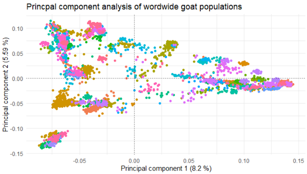
Figure 9.1: Results of the PCA analysis
Nice, isn't it? Personally, I like it a lot!
During these sessions, we have produced a similar graph to the researchers working on the data initially. I will put it below and make some comparisons between the two.
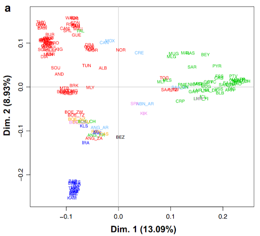
Figure 9.2: Results of the PCA analysis from Colli et al. (2018)
The figure above is from Colli et al. (2018), published in Genetics, Selection, Evolution (open access), figure 4a.
You see that the general shape of the two graphs is virtually identical, which is kind of expected, as we used the same initial data and same methods. There are a few minor differences though, worth pointing out.
Maybe the most striking one is the difference in explained variance shown on the axes. This might be due to the differences in quality control. If you check out the Methods section of Colli et al. (2018), you will see that they looked at the data from a variety of different angles, not just missingness. Also, this is a good example of what other factors could be taken into account in QC, so it is worthwhile to check it out anyway.
The other issue is that in the paper there are much fewer data points. This is because only the middle point, i.e. one point for each breed is visualized. Additionally, they have avoided the necessity of the legend by putting the breed abbreviations straight in the figure. Still, many of them are overlapping and unreadable, but arguably better than a legend with hundreds of entries.
The third thing I want to point out is the color scheme. In our case, there is a different color for each breed. This leads to virtually indistinguishable colors for some of the breeds. The problem is even more serious for people with any form of color blindness. Yes, it is pretty but otherwise utterly unusable. In Colli et al. (2018) they use color codes for the continents, adding yet another nice piece of information to the figure: red=Africa, green=Europe, blue=West Asia, pink=North America, light blue=South America, orange=Oceania, black=wild goats.
9.3 Exercise Summary
If you have followed along with the other posts, you know that I usually give you a small exercise at the end. It will not be so in this case. Yes, I could come up with another freely available data set and ask you to do a PCA for it.
But in this case, I will not do that.
This chapter is the final piece in a workflow, where I wanted to describe how to process SNP genomic data, without any previous experience. Well... With knowledge of the theory side, but no experience in practical data handling and analysis.
Yes, many other things need to be said and done to increase your proficiency. But considering that you started with no previous practical experience, we have to also acknowledge that you have come a long way.
Well done! Congratulations on your achievement!
At this point my Excercise for you, if you really want to have one, is to celebrate. Maybe not by throwing a big party, but in a small personal way. Treat yourself with a chocolate or something, take some time off, play a game, think about the work-life balance.
If you liked these chapters, consider subscribing to my YouTube channel and follow me on Twitter. These are just two simple clicks for you, but for me are an indication of interest and motivation to go forward!
This is of course not the end! I plan to follow up and extend the book and also on the YouTube channel with various topics related to genetics and genomics. So stay tuned!
As for now, thank you for your time, and have a nice day!
If the embedded video does not start, click it again to "Watch on YouTube". Direct link: https://www.youtube.com/watch?v=l5afbHnw6Uw